Constraint Layout in Jetpack Compose: Create complex and responsive android layouts on the fly.
Building complex and responsive layouts has never been this easy.
Introduction
Building a UI is one of the essential yet mandatory things for android applications.
While working with XML, we used to build layouts with a Linear Layout, Relative Layout, Frame Layout, and Constraint Layout. In general, we prefer Constraint Layout over others as it gives you the full flexibility to build responsive yet complex layouts.
Note: This blog will NOT cover the concept of constraint layout but will cover how you can implement it in Jetpack Compose.
Fundamentals first!
- We can implement constraint layout using various bounds that are available by default to a composable when working with constraint layout.
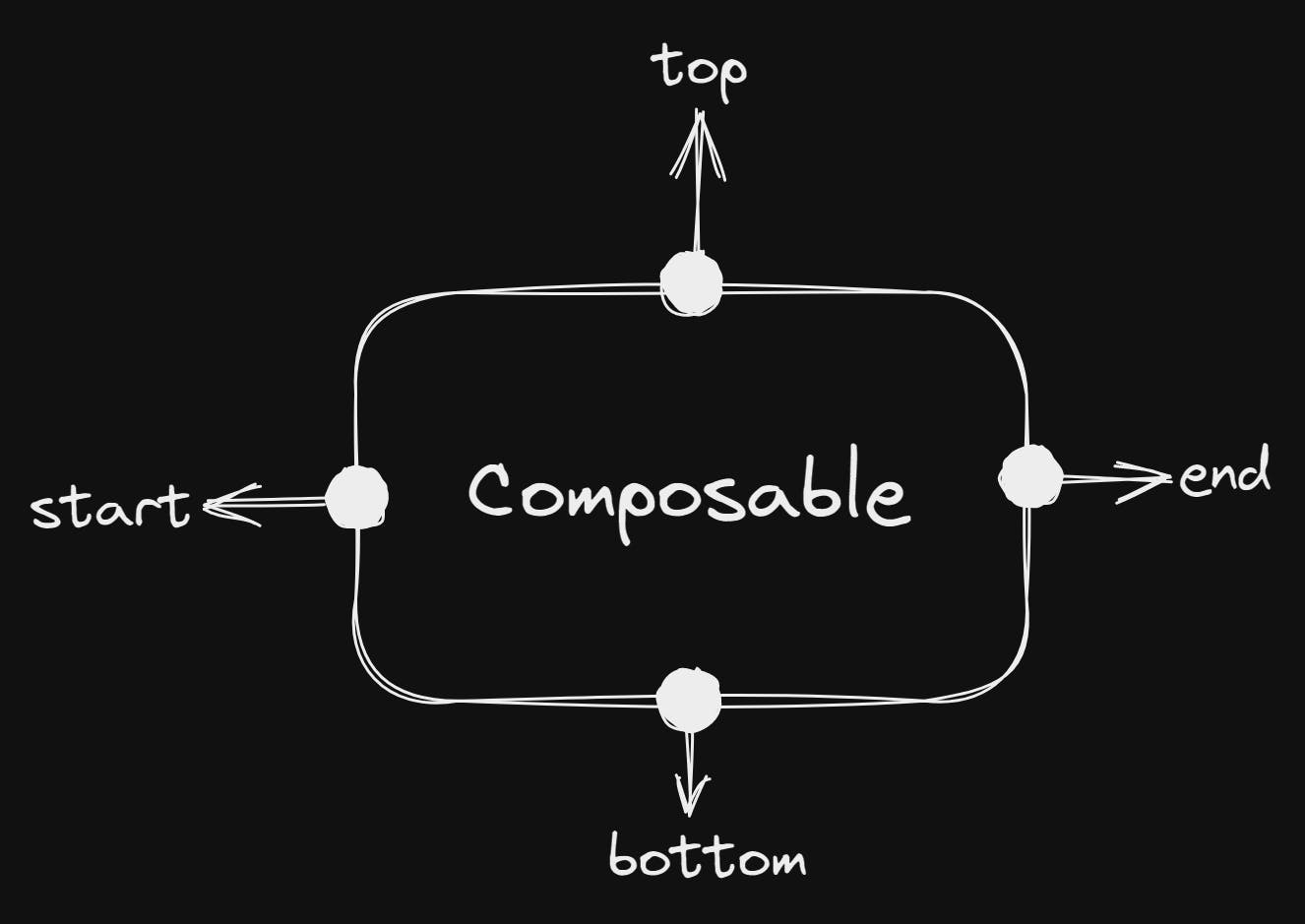
start = left-hand side of a composable
end = right-hand side of a composable
- These particular bounds are used to align and rearrange the composables as per our needs in the layout. It also makes things easier if we want to build complex layouts with all the UI elements required.
Do we really need a constraint layout every time?
- While working with jetpack-compose, we can probably build most of the UI stuff with Row/Column/Box, which makes things pretty simple yet we can build an awesome UI as below:-
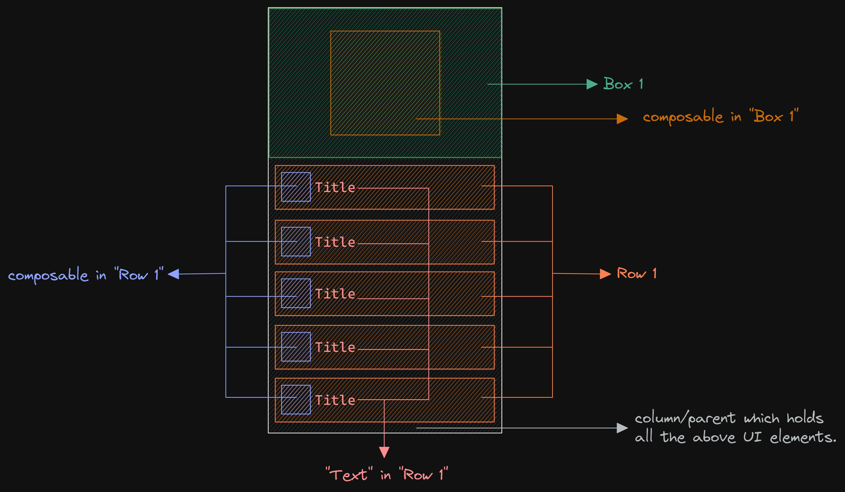
Building UI in Jetpack compose is pretty simpler than XML(in most cases). As you can see, we didn't use any sort of constraint layout here. We just used composables, rows, boxes, and so as per our UI requirement.
The point over here is that we don't need to use a constraint layout every time we build a UI; we can build a pretty good UI even without a constraint layout in jetpack compose.
But what if we want to build a complex layout that includes the arranging of composables as we want, as below?
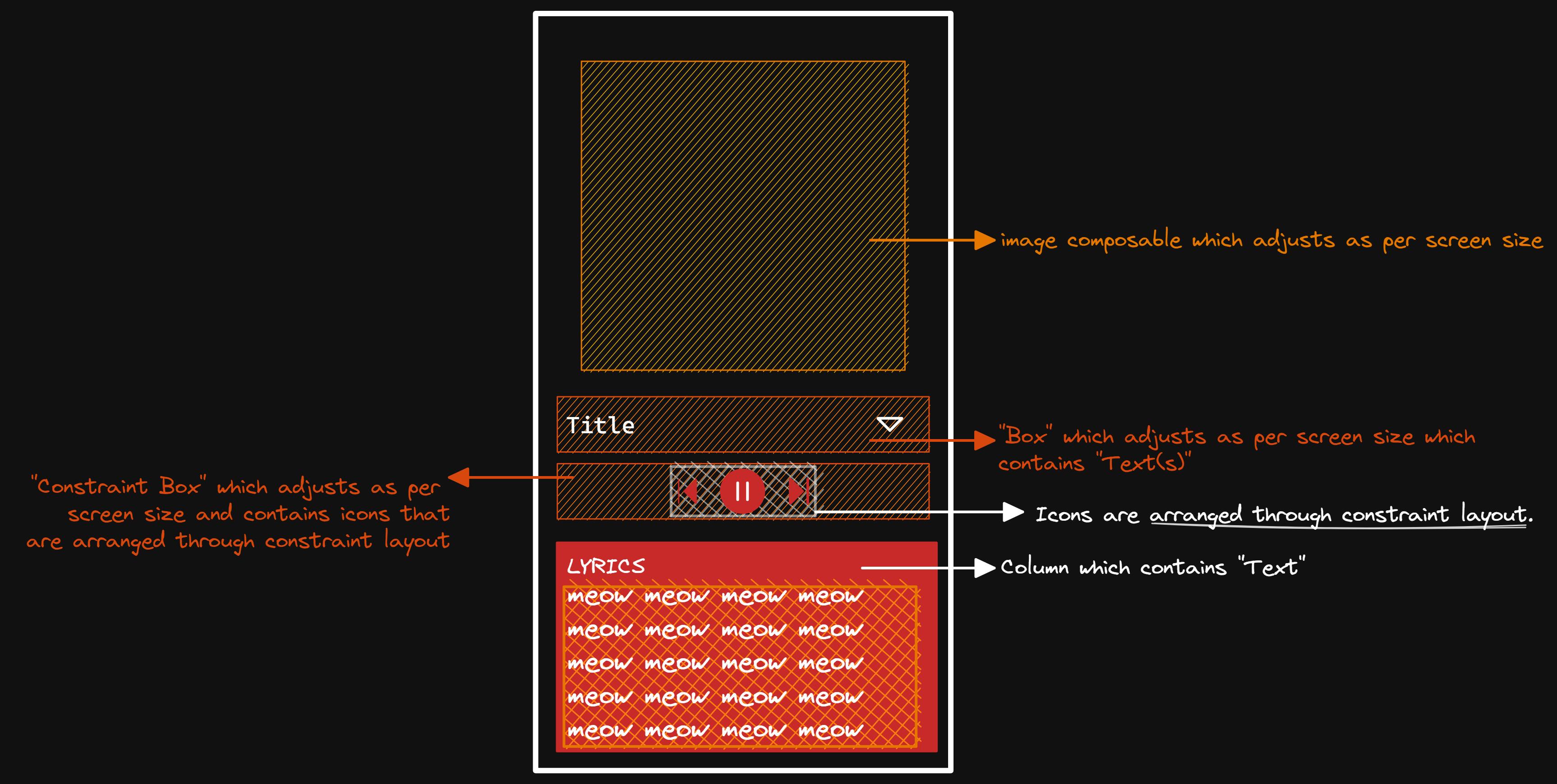
- That's where constraint layout comes into the game.
A ConstraintLayout is a layout that allows you to place composables relative to other composables on the screen. It is an alternative to using multiple nested rows, columns, boxes, and custom layout elements. ConstraintLayout is useful when implementing larger layouts with more complicated alignment requirements.
Implementation of Constraint Layout in Jetpack Compose
Dependencies
- Constraint Layout is not available by default; we must add a dependency to proceed further.
implementation "androidx.constraintlayout:constraintlayout-compose:[version]"
- Replace the [version] with the latest version, which is available currently.
Implementation
- If you recall, we used to implement constraint layout in XML as follows, where we specified id, constraint bounds, margin, padding, and so on:-

- As we are working with jetpack-compose, we can't drag and drop as we could do in XML, but implementing a constraint layout is actually a simple thing in jetpack-compose.
This is the sort of mapping that we'll use to implement constraint layout in jetpack compose:-
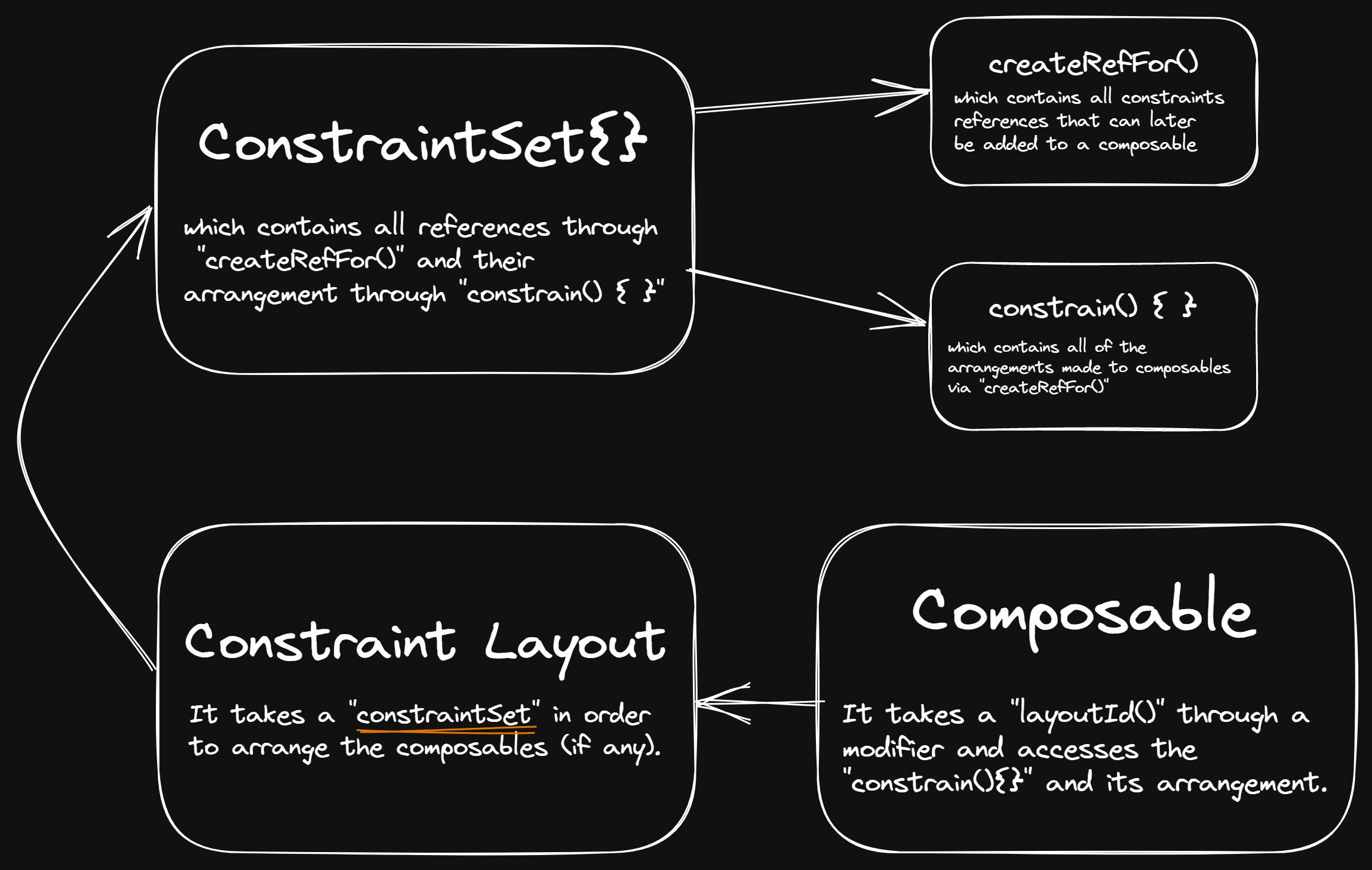
- We need to create something known as a "ConstraintSet{ }" in which we'll code how the composables should be arranged as per our needs.
val constraintsSet = ConstraintSet {
...
}
- In Jetpack-compose, we need to create a reference through createRefFor( ) for a composable, which we can later add to a composable using a modifier for accessing its arrangement/alignment
val constraintsSet = ConstraintSet {
    val composable1= createRefFor("composable1")
    val composable2= createRefFor("composable2")
    val composable3= createRefFor("composable3")
}
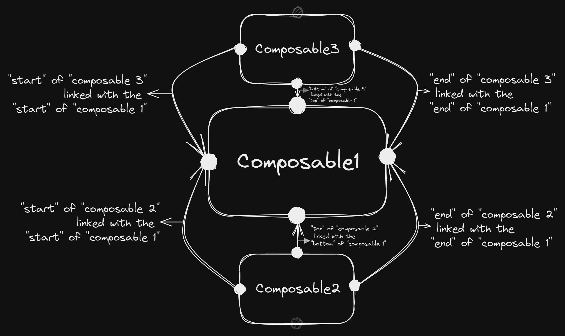
- In order to arrange composables as per our needs, we need to attach the bounds of composables through constrain(variableName){ } and link them to respective composables through linkTo()
val constraintsSet = ConstraintSet {  // constraint set
    val composable1= createRefFor("composable1")  // creating refernce
    val composable2= createRefFor("composable2")  // creating refernce
    val composable3= createRefFor("composable3")  // creating refernce

     constrain(composable1) {   // arranging "composable 1" bounds
                top.linkTo(parent.top)    // linking "composable1" top to "parent" top
                start.linkTo(parent.start)  // linking "composable1" start to "parent" start
                end.linkTo(parent.end)   // linking "composable1" end to "parent" end
     }

   constrain(composable2) {    // arranging "composable 2" bounds
                top.linkTo(composable1.bottom)    // linking "composable2" top to "composable1" bottom
                start.linkTo(composable1.start)  // linking "composable2" start to "composable1" start
     }

   constrain(composable3) {   // arranging "composable 3" bounds
                top.linkTo(composable1.bottom)    // linking "composable3" top to "composable1" bottom
                end.linkTo(composable1.end)  // linking "composable3" end to "composable1" end
     }

}
- If we visualize the above code, our UI should look like this:-
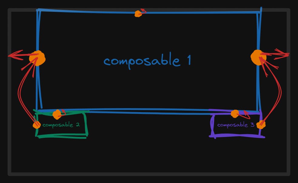
But it won't look like this, because we didn't add the references to the constraint layout and composables yet🤪
We can create a constraint layout by calling ConstraintLayout( ) { } and passing the constraintsSet variable to access the references we created in it.
ConstraintLayout(
     constraintSet = constraintsSet,  // Don't forget to add "constraintsSet" variable
         modifier = Modifier  // The modifier assignment is upon you
                    .fillMaxSize()
    ) {
   // UI code
}
- Now, as needed, add composables to the constraint layout block, and don't forget to include .layoutId ("refID") through a modifier so that we can link the respective composable to the reference we created earlier.
ConstraintLayout(
        constraintSet = constraintSet, modifier = Modifier
            .fillMaxSize()
    ) {
        Box(     // composable1
            modifier = Modifier
                .padding(top=20.dp)
                .requiredWidth(250.dp)
                .requiredHeight(100.dp)
                .background(Color.White)
                .layoutId("composable1")   // reference 'id'
        )
        Box(     // composable2
            modifier = Modifier
                .padding(top=20.dp)
                .size(100.dp)
                .background(Color.LightGray)
                .layoutId("composable2")   // reference 'id'
        )
        Box(     // composable3
            modifier = Modifier
                .padding(top=20.dp)
                .size(100.dp)
                .background(Color.LightGray)
                .layoutId("composable3")   // reference 'id'
        )
    }
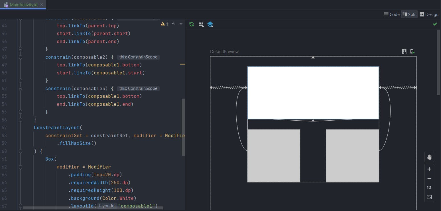
Your final code should look similar to this
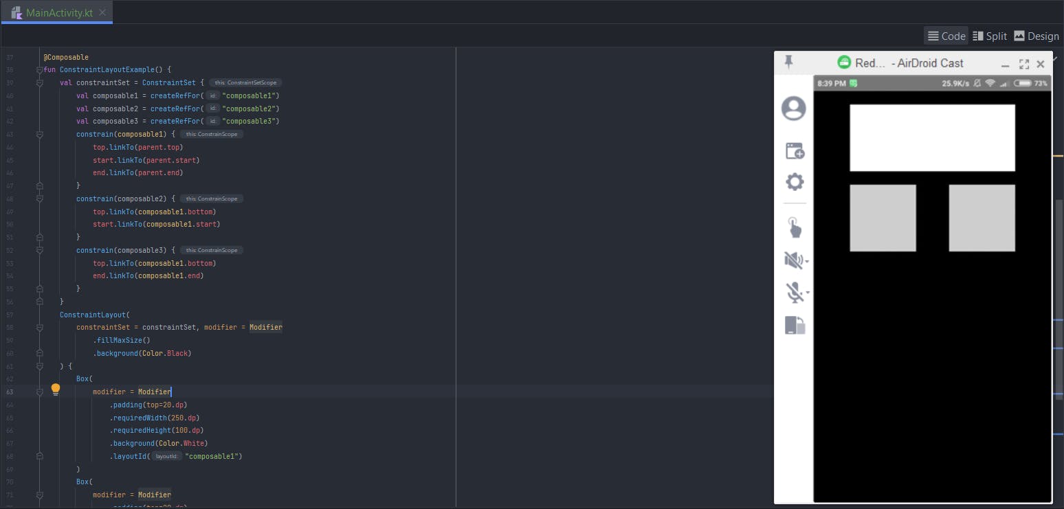
It ended up like this😉
Compose Preview:-
Launching the application on a mobile device:-
- If you want to work with constraints inside a Box, use
BoxWithConstraints( ){ }rather thanBox( ){ }, which also allows you to useConstraintLayout( ){ }
 BoxWithConstraints( ) {   //   0 . "BoxWithConstraints"
        ConstraintLayout(constraintSet = constraintSet) {  //   1 . "BoxWithConstraints" which contains "ConstraintLayout" stuff!
         // code
      }
}
Practical Approach (example) while working with
BoxWithConstraints( ) { }
Cheers, you did it🥂🔥

